TechSteps Coding Bootcamp
Case Study: Finding mentorship while changing careers
TechSteps is a coding bootcamp and wants to better utilize their mentorship program after repeated feedback from students requesting a more approachable mentorship program during their coding bootcamp experience.
Project Overview
Duration - Spring 2022
The problem - TechSteps is a coding bootcamp and wants to better utilize their mentorship program after repeated feedback from students requesting a more approachable mentorship program during their coding bootcamp experience.
The goal - Design a mentor request flow that connects coding bootcamp students with skilled mentors.
My role - UX Researcher, UI/UX Designer
My responsibilities - Conduct user interviews, competitive research, ideation, paper and digital wireframing, low and high-fidelity prototyping, conducting usability studies, accounting for accessibility and iterating on designs
Tools - Adobe XD, Figma, Jamboards, Google Suite, pen and paper
Scope and constraints - This project covers the user journey of a student seeking mentorship. The scope is contained to the mentee’s experience and assumes that the Mentor has already onboarded to the system and created their own biography to share with potential mentees.
Process
Empathize > Define > Ideate > Prototype > Test
Empathizing with users - User Research
TechSteps is a coding bootcamp that offers an immersive coding bootcamp experience for beginners who have a goal of pivoting into a career in software development. Many of these students come from diverse backgrounds and have different feelings and emotions when it comes to learning this new skill.
I wanted to dig deeper into those emotions to understand how they may or may not impact how students seek mentorship.
I interviewed 5 people who had recently graduated from a tech bootcamp to learn more about their experience. Key questions I was focused on were:
-
How does the bootcamp fit into your current routine?
-
What does mentorship mean to you?
-
How do you normally seek help when stuck?
-
What feelings or emotions do you experience when seeking help for school / work related functions?
-
When seeking mentorship, what information do you look for in a potential mentor?
-
Do you prepare and/or how do you prepare for mentorship sessions? (or 1:1 if in a work environment)
Key Findings
I noticed some themes when speaking with users and most people I spoke to leaned towards different ends of the spectrum with respect to:
-
Feedback styles and relatability to their mentor
-
Level of hesitation with reaching out to mentors
-
Knowing how to “drive” the conversation
-
Being able to get help on specific topics associated with a career change (tactical stuff, mental health stuff, job search and interviewing help)
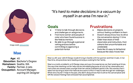
Personas
Journey Mapping
I wanted to map the emotions and key findings that I discovered during research to specific actions through a journey mapping exercise. This helped me start the ideation process by identifying key events that would need to be considered for design; such as viewing a mentor’s information and thinking through how to prepare for a session.
This exercise was helping in identifying the main problem statement I wanted to design for: Tech bootcamp students are busy and motivated and need an easy way to find mentorship because they want feedback and guidance as they work towards changing careers.
Challenges
Knowing that my direct competitors are bootcamps with hefty paywalls to break through to learn more insights on their mentorship process and interface to request them I had to pivot my initial research plan. I focused on finding 3-4 indirect competitors and did some searches to learn more about mentorship at other bootcamps. I learned that most students rotated through seeking help from TAs and instructors rather than usually having a dedicated mentor.
I also learned that “mentorship” is less of a title and more of a relationship driven by feedback and guidance. With that in mind, I chose to focus on connecting students with TAs, instructors or volunteer “mentors” for their respective cohorts.
Ideation
I started the ideation process with limited constraints as a way to stay open to a variety of ideas by completing How Might We statements and a Crazy 8s exercise. I quickly realized that I had a lot of ideas which pushed the scope of the initial flow I wanted to design (for example, I wanted to find a way to set reminders to schedule a mentor session, give students the option to provide feedback to mentors and even think through an onboarding process that would dig deep into their learning style and match them with a mentor based off of learning habits). I still see value in exploring these options, but I knew that they would need separate lines of discovery that wasn’t in the scope for v1.
I landed on a main flow of browsing mentors, selecting a mentor and scheduling a session. This provided more focus for me as I started to think through a site map and start to identify the actual screens I would need to design for.
From there I was ready to move into low fidelity wireframes.
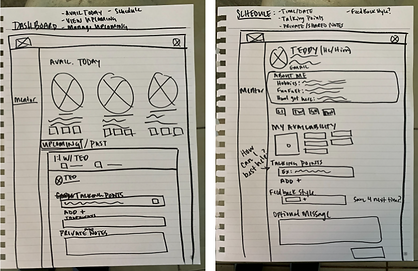
Prototyping Part 1 - Low fidelity wireframes
Now that the scope of my project was more clear, I still had variations within that scope that I wanted to explore. Paper wireframes were a great exercise to help me think through a higher volume of ideas in a shorter amount of time. I sketched out about 5 ideas per page and starred the elements that I liked. Afterwards I took all of the starred elements and combined them into a wireframe that I was comfortable moving forward with. I used Adobe XD to create the digital wireframes that I would present in user testing sessions.
Link to low fidelity prototype
Testing - Part 1
I presented the wireframes to a new set of users who were still current or recent bootcamp grads with the goal of understanding:
-
how easy it was to navigate through the mentor request flow
-
What information would students need to know before deciding to book a session with a mentor?
-
What information would students want to share with a mentor before booking the session?
-
What type of communication would students expect or need after booking a session?
Insights
“Less is more” was the overwhelming theme that I learned from the user testing sessions.
-
Users didn’t want to feel pressured to commit so quickly. Students were surprised to see a booking flow when they were simply trying to learn more about the possible mentor.
-
Users were overwhelmed by the amount of fields that they had to fill out to schedule a session (even knowing that they were optional)
-
Students have methods and habits that don’t need to be changed. Students usually have direct lines of communication with their TAs and instructors. Students also have their own (sometimes sophisticated) note taking systems too. All that said, there was no reason to reinvent the wheel or clutter up the booking flow with these fields.
One quote that stood out to me was “I tend to second guess myself a lot.” In my wireframes, I chose to present the same information provided during booking within confirmation details as a way to reinforce session objectives and assist with preparation and guiding the conversation. This decision actually had the opposite impact that I was hoping for! I realized that I had over designed the experience. Fortunately, my designs were low fidelity enough to where this wasn’t expensive in time to adjust.
Iterations > Prototyping - Part 2
-
My first main focus was to distinguish the evaluation and decision-making steps of the main user journey of choosing a mentor. I created a separate bio page as a way for students to evaluate if the mentor would be a good fit.
-
[Before and after pics]
-
-
I simplified the scheduling page and upcoming sessions page by removing private notes and stripping the instant message feature. Feedback validated the assumption that students have their own means of keeping their personal notes and getting in touch with TAs or instructors via Slack or email.
-
Students have busy schedules and need to be able to schedule sessions further in advance. I updated the availability filter to display a month by month basis instead of 3-7 days out. Given how student schedules can fluctuate, recurring meetings also aren’t helpful. Students need to be able to cancel and reschedule meetings and can’t be locked into a recurring session, especially knowing that their bootcamp time replaces much of their personal time.
Prototyping Part 2 - High Fidelity Designs
I decided to use green as the main color for the TechSteps brand since it symbolizes learning and development. I chose black and gray as accent colors to mimic many of the darker themed code text editors that I’ve seen developers use. I chose clean sans serif fonts for typography and utilized React’s Material UI component library along with Google icons throughout the designs and applied all of this to my high fidelity mocks.
Testing - Part 2
For my second round of feedback I wanted to focus on the following two main questions to better understand the impacts of my main changes.
-
Do students have enough information to make a decision when viewing a mentor’s bio?
-
Qualitative feedback on the simplified view of the scheduling page.
I reached back out to the same group of users and consolidated my findings below.
The results
All users I spoke with responded positively to the “at a glance” breakdown of mentor’s expertise as that was a helpful way to visualize the context and subject matter expertise that the different mentors offered seeing that mentorship as a whole is not a one size fits all solution. With that in mind, users also responded positively to a more “personal” About Me section as a supplemental way to better understand the mentor’s tone and personality.
Users also responded well to the simplified scheduling workflow with fewer fields. Users were curious to learn more about the “ownership” with respect to who owns creating the takeaways. I heard a pretty even split across the 5 people I spoke with. 3 people said takeaways should be the responsibility of the mentor to create and 2 said that it should be on the student to create those. All users responded positively to the idea of a shared ownership between the mentor and mentee.
Next Steps
I originally designed the takeaway section as a way for students and mentors to make the most of the session by coming up with actionable steps to reflect on their next meeting or in the future when viewing their completed sessions. With that in mind, I think the takeaways / action items feature is something that warrants more discovery work for future iterations.
I would rely heavily on analytics to inform next steps with my designs. Before handing off to engineering I would want to sync with my product manager and use our organization’s ORKs and KPIs to inform how we decide which events we choose to keep an eye on or ask the engineering team to start tracking. Specifically events like page drop off rate, time spent on page and heat maps could give us great insights into where to focus next usability studies to inform our future iterations.
From a business perspective, I would also want to know how many sessions were booked and see how that changes throughout time per cohort and would be curious to know why sessions may increase or decrease throughout the semester.
Let’s get in touch!
Thanks so much for reading along! To see more of my work, please take a look at other case studies I’ve written or checkout my LinkedIn profile. To get in touch with me directly, please send me an email to shaw.leah.d@gmail.com.